The power of data storytelling in asset management
Published on October 8th, 2024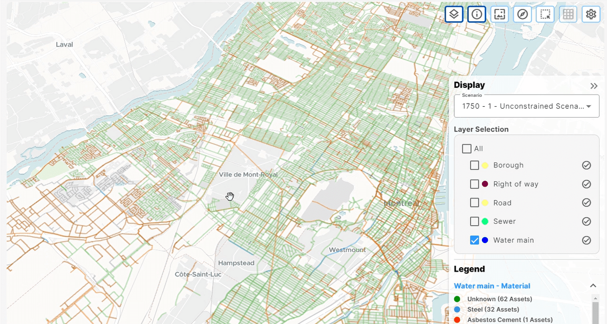
Data storytelling is an incredibly important skill in any vocation that deals with complex data and analytics. By turning difficult concepts into an easy-to-follow narrative, proper data storytelling inspires an audience to deepen their understanding and make data-driven decisions.
This skill has a number of practical applications, but it can be particularly useful in asset management to properly convey insight to decision-makers.
Table of Contents
Why is data storytelling valuable?
Data storytelling is the process of translating complex, highly technical analysis into a compelling, easy-to-follow narrative that empower the audience — often those who may not have the same technical background or expertise — to share the insights you have unlocked, make informed decisions, and take action that results in meaningful outcomes.
According to Stanford professor Chip Heath, 63% of his students remembered lectures that incorporated narrative elements. Meanwhile, only 5% of his students could recall lectures that were purely statistical analysis.
The stark difference in how memorable these Stanford lectures were is indicative of data storytelling’s value. By delivering insights within a narrative, there is typically greater stakeholder engagement, better communication and collaboration, and overall increased data literacy.
Creating a successful data story
Data storytelling can be a very powerful tool to bridge the gap between technical and non-technical stakeholders.
But how does one bring data to life and make it not only informative but engaging?
Typically, effective data stories are made up of four core components:
Data
A data story cannot be told without data.
This can include both structured and unstructured data from sources like surveys, customer behavior, financial records, or asset performance measures. For the story to be effective, the data must be accurate, reliable, and directly relevant to the narrative.
Analysis
Data analysis involves examining, cleaning, transforming, and interpreting data to extract valuable insights.
This process uses statistical techniques, data mining, or machine learning algorithms to reveal patterns, trends, correlations, and anomalies. It is a critical step in identifying key findings and crafting the narrative of the data story.
Narrative
The narrative is what makes a data story a story worth remembering.
This is a process of presenting the data and analysis in a structured and engaging manner. It should contain a clear objective or message. Something to anchor the audience through the story, helping them understand the significance of the insight being shared. Context is a powerful tool to help audiences understand the story.
The more concise and compelling it is, the more memorable and accessible it tends to be.
Visualization
Visualization provides essential support in any data storytelling, translating complex data into intuitive charts, graphs, maps, and matrixes.
By creating custom and interactive dashboards to support your data story, you can easily highlight patterns and trends, or compare the options on the table.
Telling your asset management story
Data has transformed asset management.
Physical characteristics, condition, age, location, maintenance history, criticality, utilization, degradation rates, disposal costs, capital and operating expenses, and risk probabilities are all data points that tell us which assets need to be maintained, repaired, and replaced, and when.
But how do you communicate why it’s more advantageous to prioritize a certain type of asset over another? How do we demonstrate the consequences of failing to act now?
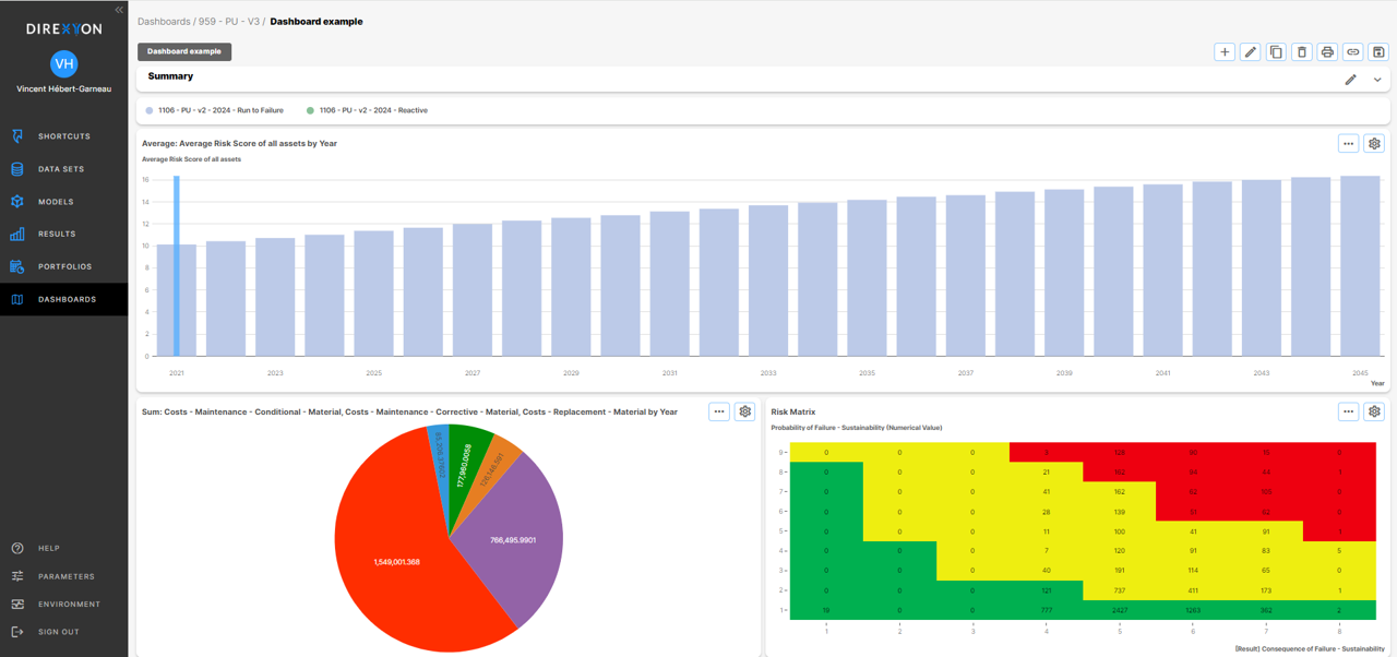
When dealing with an enormous amount of data, as asset managers frequently do, structuring it into a narrative is essential. And to do so, Direxyon’s custom dashboards play a crucial role in this process, enabling the creation of scalable, repeatable visualizations that help bring the data in your asset management story to life.
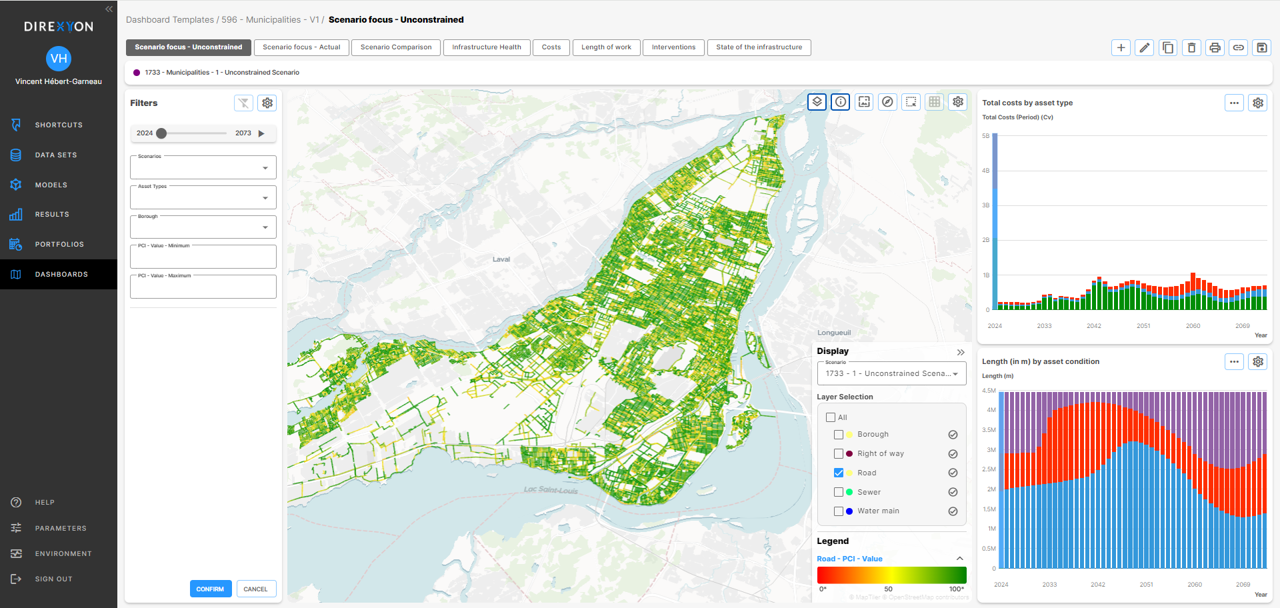
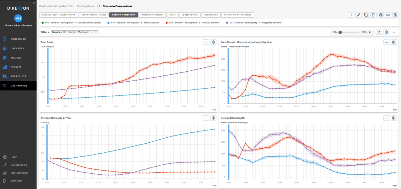
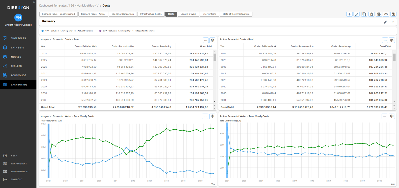
Creating custom dashboards in Direxyon
Recognizing the need for a user-friendly, repeatable way to create both ad hoc and templated dashboards to share insights, Direxyon developed the Dashboards module within its its AIP solution to meet these demands.
Not only can organizations simulate their asset and financial performance for over 100 years with Direxyon, they can also use it for data storytelling.
The Dashboards users can create can use any combination of:
– Line charts
– Bar charts
– Pie charts
– KPIs
– Risk matrixes
– Tables
– Maps
A series of filters can be added to any dashboard page so users can focus on a subset of the available information.
Tomorrow’s data story may be completely different today’s. Today’s questions may not fit on yesterday’s dashboards. To make sure users have every opportunity to tell their asset management stories their way, Direxyon offers and powerful yet nimble set of custom visualizations to make the complexity of strategic asset management accessible for all stakeholders.
Sharing insight with Direxyon
Direxyon’s AIP solution lets organizations simulate the entirety of their networks for up to 100 years. An infinite number of investment scenarios can be generated, testing every possible intervention or constraint to find the optimal path forward for your organization.
As a result, the insight generated must be effectively communicated. And this can be done with custom or ad-hoc Dashboards.
Make your asset management data accessible with Direxyon’s nimble, easy-to-use, and fully customizable dashboards.
Contact us today to find out more about how Direxyon can improve your asset management data storytelling.
Let us show you how it works
Our product specialists will walk you through our proven approach to enhance your capital investment planning.

Explore resources
-
 News
NewsDIREXYON Launches GO, an AI-Powered Platform to Streamline Strategic Infrastructure Investments
Read more : DIREXYON Launches GO, an AI-Powered Platform to Streamline Strategic Infrastructure InvestmentsSelf-serve Digital Twin delivers clarity to strategic infrastructure decisions Montreal, QC, September 18, 2025 – DIREXYON Technologies today announced the launch of DIREXYON GO, a self-serve platform that simplifies and accelerates Asset Investment Planning (AIP) for municipalities and utilities. DIREXYON…
-
 E-book
Turning Wildfire Data into Smarter Investments
Read more : Turning Wildfire Data into Smarter InvestmentsYour wildfire data can do more than predict where fires may spread. It can guide the decisions that protect your grid and your communities. Wildfire threats are rising, regulations are tightening, and budgets are stretched thin. Utilities need more than…
-
 Blog
BlogWhat is Strategic Asset Management?
Read more : What is Strategic Asset Management?Strategic Asset Management is more than a buzzword. It’s a transformative shift in how municipalities and electric utilities manage infrastructure, budgets, and long-term risk. At its core, strategic asset management is about using data to make better decisions. Instead of…